Pages

Tuesday, December 28, 2010

Kate Spade's Things We Love


Oh yay! I can't help. I just have to share this fabulous THINGS we LOVE at Kate Spade.

Browse and jump into Kate Spade's popsy world.. and if you're like me, it feels like serotonin booster, you know, the very thing that makes you feel happy from the inside your brain :-))


Monday, December 27, 2010

Graphic Goodness Exercises 1: Day 11


Hurraa! I hope you had a very nice Christmas!

I also hope you had good exercises with the graphic goodness and now we're going to talk about using 'eraser tool'. In the first part I include the PSD file for you to practice using the eraser tool, and I also uploaded the PSD file of the image above for your to play :-)

Download the files here:

The exercise
The image

So, let's start now :-)


Open the exercise file. Click on the eraser tool as shown in the screenshot above. The eraser features panel will appear at the top of the screen below the menu, and you can experiment yourself with the diameter, mode, opacity, etc. It's fun! :-)

Now make sure you are on the right layer. Click-and-hold your mouse and drag erasing the image. Ay, can you see it? Play again. As much as possible (...kidding...but a lot of practice will help :-))


Now I just pasted a red graphic to the working board, and I want to make a heart-shaped image.


so I clicked on the eraser tool again, and set the diameter to a small one. Then I use it to create a heart in the center of the red graphic.


Once I got the shape, I erase the outer area of the red graphic (I enlarge the diameter first to make it easier to erase), so, the red heart stands alone now.


Yippi! Now I got the brown and red graphics to create flowers. I added more elements that you have learned from the previous exercises. Open the PSD file of the image and you can play with it. It's another fun exercise :-)

Have a great week!


Monday, December 20, 2010

Auntie cooked for a special weekend lunch


Hello friends! How's your Graphic Goodness exercises going? Did you practice alot? ;-) It's been pretty busy around here..but here I'm back! Starting this week we'll catch up again with the Graphic Goodness Gratitude Cards Day 11 onward.

I'm just so happy that last weekend my aunt was visiting and she cooked for lunch the food my late grandma used to make. I don't how to say it in English, but it's kind of meatball...let's say it 'Javanese meatballs'. It's a mix of minced beef with finely chopped cabbage and carrot and egg, and cooked with tomato and spices.

In addition our cook prepared fried minced tofu, boiled spinach and soy bean, and spiced grated coconut (it's called 'Urap'). And of course we always have rice as staple. Love it. It was a special Sunday lunch at home with my aunts and cousins. A good energy to prepare a week with more graphics on the blog. I'm such a lucky niece of my wonderful aunts :-))


Tuesday, December 7, 2010

Graphic Goodness Exercises 1: Day 10


Wow! Day 10. Let's wrap up a bit what we have learned until day 9:
  • copy and paste the digital papers to the working board
  • rectangular and elliptical marquee tools
  • move tool
  • lasso tools
  • duplicate layer
  • type tool (including coloring and changing sizes)
  • arrange layers
  • transform tools
  • select and cut layer to create shapes

If  you missed the Graphic Goodness Exercises 1 -  Week 1, go here.

Today using the same image as day 9, we are going to practice:
  • group or merge layers
  • simple drop shadow tool
  • using brush tool
Ok, let's start :-)

First, open the PSD file from Day 9.  You can see on the layers list that there are a lot of layers in the document.

Now, start experimenting. Take two or more layers that you want to put in one group, or, to merge into one image.
  • click a layer on the layers list
  • press Ctrl button and click another layer you want to put in one group or merge with the first layer 
  • click "Layer" on the menu at the top, then "Group layers" if you want the images to still be individual only that they are 'together' - or "Merge layers" if you want to merge the images into one image.
  • in the sample PSD file Day 10, I merged the entire small layers to make one doll image
  • repeat the steps several times until you get the hang of it

Second, let's experimenting now with dropping shadow to the images / layers
  • start the practice with one layer. For example the 'Thank You' text. Make sure you're on the right layer. Now click "Layer" on the menu at the top. On the sub-menu, click "Layer style" then "drop shadow" and the layer style box will pop up
  • now it's time to play with the shadow box :-) you see in the picture below, on "drop shadow structure", I chose "multiply" on the 'blend mode' box, 35% opacity, 120 degree angle, distance 5px, spread 0px and size 5px 
  • repeat these steps with other layers, and try to experiment with various blend mode, opacity, angle, distance, spread and size


Third, just a quick taste to brush tools, because I want to add pinky blush to the doll's cheeks (we'll talk more about brush tools in a few days):

  • click on the brush tool on the tools menu as shown in the picture below


You see in the picture above:

  • when the brush tool is selected, the brush menu appears at the top of the working board
  • here I set the brush size to 32, mode normal, opacity 50%, flow 100%
  • and on the toolbox, you see I already changed the color to pink
  • if you still have other color there, double click the color box, and another color box will appear, and you can set the color of your choice
  • click on the layer where you want to apply the brush tool (in the sample, it's the face or layer 2)
  • now you can 'spray' the pink paint with the brush tool to the doll's face to create blushing cheeks
  • repeat these exercises. you can always click on 'Step Backward' or 'Undo' by clicking first "Edit" on the menu at the top, whenever the result of your brush-painting is not yet satisfying, and then try again and again. have fun! :-)

to be continued....


Sunday, December 5, 2010

Graphic Goodness Exercises 1: Day 9


Hello friends! Sorry for the absence.... I got sick and had difficult time staying for sometime in front of the computer ... learned something, though, next time I will use the scheduled post so there will be no interruption :-)

Download PSD file Day 9

So, before we start, I'd like to make sure that by now you have followed the tutorials and must be familiar with:
  • copy and paste the digital papers to the working board
  • rectangular and elliptical marquee tools
  • move tool
  • lasso tools
  • duplicate layer
  • type tool (including coloring and changing sizes)
And from week 2:
  • arrange layers

If  you missed the Graphic Goodness Exercises 1 -  Week 1, go here.

Today we are going to learn about using more tools and functions that I mentioned in the previous post:
  • transform tools
  • more select and copy/cut functions
And tomorrow, using the same image as today's, we are going to talk about:
  • group or merge layers
  • simple drop shadow tool

Ok, let's start!

First, we are going to make a doll / girl image. On the step by step below, you will learn about transform tools and some variations on select tools. You will also use a lot of 'arrange layers' function so it's a good repetition from what you learned in the previous post. Anyway, you will always have to repeat most or all of the steps, which means you will get a lot of practice along the way :o)
  • create a working board. Here I have the 640 x 480 pixels as usual, and copy-pasted the light blue paper
  • make an ellips from the light-beige paper, for the head
  • make three yellow ellips and arrange them around the bottom of the head. The light-beige head might be place under the yellow ellips, so put it forward using "arrange layer" function (see tutorial Day 8)
  • make a purple ellips and put it under the yellows
  • make a long dark blue ellips as shown here, for the dress

Second, to make a bell-shaped dress, use elliptical marquee tool on the dark blue ellips. Since you want to erase the outer area of the marquee, click "select" on the menu at the top, then click "inverse". When the inverse area is selected, push the "delete" button (on the keyboard) and then you will get the bell-shaped dark blue - as shown in the pictures below. Note: make sure that you work on the right layer (check with the layers list on the right).


Third, now we are going to start using the transform tools.

I want to make the sleeves which have the same shape as the dress, only smaller. So:

  • make a duplicate of the blue dress
  • on the menu at the top, click "edit" then "free transform"
  • hold and drag your mouse to make the image smaller


Now I want the sleeve I just created to rotate a bit. So repeat the steps "edit" -> "free transform" and you'll see once again the blue sleeve is 'wrapped' by a box with 7 transform points as shown above. Place the cursor outside the transform box until the rotating cursor appears, then hold the mouse and rotate the sleeve. Apply the transformation.

Note: when you do the transformation, make sure that you are on the "move tool"

You now get the sleeve image...
  • make a duplicate
  • click "edit" -> "transform" -> "flip horizontal" ... and voila you've got two blue sleeves one for the right, one for the left side of the dress
  •  use move tool to place them on the top-sides of the blue dress.

Fourth, now we are going to make the legs and shoes.
  • using rectangular marquee tool, make the legs from the light-beige digital paper
  • make a duplicate then place them behind the dress
  • using elliptical marquee tool, make a small blue ellips
  • almost similar to step two (on how to make the bell-shaped blue dress) - create a selection area with elliptical tool on the small blue ellips (check with the layer list that you are working on the right layer)
  • press "delete" button and you'll get a half moon image. duplicate the image, then place them on top of the legs


Fifth, to create the hands
  • I made a duplicate of the leg
  • I wanted to make the image thinner, so I clicked on free transform tool (which means "edit" -> "free transform") and place the cursor to one of the middle-side points, and once the transform arrow cursor appear, hold and drag the mouse inward, to create a thinner rectangle. Apply the transformation.
  • Now I wanted to rotate the image to suit the sleeve image. Repeat step 3 on how to rotate the image. Hints: free transform tool -> rotate
  • Make a duplicate, click "edit" -> "transform" -> "flip horizontal"
  • Using move tool and arrange-layer, place them behind the sleeves
  • Make a small ellips from the light beige paper. Make a duplicate then place them on the hands


Sixth, to create the hair and the face
  • repeat steps 2 on how to make the bell shaped dress, now with the black digital paper. Use free transform tool if you want to make it bigger or smaller
  • place it behind the light beige head
  • using elliptical marquee tool make an ellips from black paper. By now you know how to make it bigger or smaller :-) then use once again the free transform tool to rotate it. Place it on top of the head to make a side bang. Duplicate, flip horizontally, then place them on top of each other.
  • make two tiny black ellips for the eyes
  • repeat steps 4 on how to make the half moon images for the shoes, only now use a red paper


Voila! The girl graphics is done and now you are ready to add some more details as you like. Here you see I added hair ribbon (by now you know how to make them :-)) and the decorative bubbles and text.

Tomorrow we'll continue with dropping shadow to give a cutout and 3D-like effect to the image.

In the meantime, have a graphic goodness today! :o)


Sunday, November 28, 2010

Graphic Goodness Exercises 1: Day 8


Welcome to the first Graphic Goodness Gratitude Exercises  - Week 2!

Starting today to the next 7 days, set aside at least 30 minutes to repeat what you've learned in the GG exercises week 1, plus to get familiar with some more basic tools on Adobe Photoshop that I use most often to create my 'cutout' graphics. It is a very important step to exercise your "graphic goodness creative muscles", which means, the more you practice, the more you'll get creative... guaranteed!

And if you are already familiar with working on Photoshop, feel free to develop your own techniques later, and share it with us here, or on Facebook.

First,
start with opening (in Adobe Photoshop) the digital papers I included in the f.r.e.e. goodiebag (if you haven't got one, get it here).

By now you must be familiar with:
  • copy and paste the digital papers to the working board
  • rectangular and elliptical marquee tools
  • move tool
  • lasso tools
  • duplicate layer
  • type tool (including coloring and changing sizes)

If  you missed the Graphic Goodness Exercises 1 -  Week 1, go here.

Second, now here are more tools and functions that you will learn in this tutorial week 2:
  • arrange layers
  • transform tools
  • eraser tools
  • group or merge layers

Third
, now let's start! :o)

First, I will copy and paste the background, then blue and pink ellips, and then brown treebark to the working board.


You see above that the pink circle is on top of the blue and the brown treebarks on top of the circles.

Fourth, now I want to move the blue circle to the front, and the brown treebarks to the back.

I click my mouse to one of the treebark (see on the layer list: it's on layer 4). Then on the menu at the top, I click on "Layer" and on the submenu "Arrange". Four options pop-up: Bring to Front, Bring forward, Send backward, Send to back


Fifth, now you see the options. Click on 'Bring to front' if you want the image / layer to be on the very front (on top of other layers), and click on 'Bring forward' if you want the image to move one layer on top. The same with the opposite. Click on 'Send to back' if you want the image / layer to be on the very back and click on 'Send backward' if you want the image to move one layer behind.

Experiment with the images on the working board, practice until you really get the hang of it :-)

Notes:
Another way to move the layers is by moving / dragging the layer on the layers list. Click on one of the layer, the hold the click and drag the layer up or down. What you see on the layers list is actually where exactly the layers are placed.

And voilà! Congratulations! You've completed today's exercise! :o)

Tomorrow  we'll continue with some practices using transform tools

See you tomorrow!

Have a graphic goodness today!


Choosing authenticity


One of the things I learned from my Dad, an artist, was authenticity. It was the very word that deeply sinks into my pscyhe, and I don't know if actually I just inherited that from Dad without realising how it would have shaped my life, the way I live now. There were times in my school years I lamented why I was different from my classmates, but then coming home, Dad would give me encouragement that my 'differences' - if I stick to those - were the things that made everyone know it's "me", that made me 'stand out' and that I don't have to be ashamed that I was 'extra-ordinary'. Then I went on. I found my life, life found me. And the journey is still up and down. And I'm thankful that Life still gives me gentle reminders whenever needed. Like the video of Dr Brene Brown above. Watch it. Take notes. You'll love it.


Saturday, November 27, 2010

GGE 1 Gratitude Cards Day 7


If  you haven't done so, read the "playnote" dan "do-it-your-way challenge" for this Graphic Goodness Exercises 1 - Gratitude Cards Week 1 - here.

How I created the image above on Adobe Photoshop:
  • open the digital papers from my f.r.e.e. goodiebag
  • copy and paste the teal background
  • using elliptical marquee tool, copy and paste the blue circle, copy the layer to make 4 more, then use move tool to make the composition
  • using elliptical marquee tool, copy and paste one big purple ellips, 
  • using elliptical marquee tool, copy and paste the green circle, copy the layer to many and then use move tool to create a composition of tree leaves
  • using lasso tool, create the brown tree bark, copy and paste
  • using lasso tool, create the blue and yellow leaves, using elliptical marquee tool to create the dark brown and white circles, then use move tool to place them around the brown tree bark
  • using the lasso tool, create the light blue rain drops, copy and paste and copy layer to many, then use move tool to place the rain drops images around
  • using elliptical marquee tool, copy and paste the dark purple circle, copy layer to make 3 more, and then use move tool to create a composition of the four images.
  • using type tool, create the text. Type on this sampler: Georgia. Use the move tool to place the text as you like.
Now you can play and create your own card with the PSD file that you can download above :o)

Enjoy this little tutorial? Share it with your friends using the share buttons on the footer below...

Thursday, November 25, 2010

Graphic Goodness updates

Wow! Basically you are here for a real treat, aren’t you? *wink* I’ve got a lot of free stuff for you to enjoy, to use or to ‘play’ and you can tweak them as you like :o) Oh dear, yes, I understand the graphics would be just no-thing if they’re only for showing, they’ve got to be both of your interest and useful.

So voilà the very reason why I created the graphic goodness exercises or simple tutorials on how I created my graphics. And THANK YOU for those who gave me very useful feedback through emails… I should’ve added information about ‘what I did’ or the ‘step-by-step’ with each PSD file that you can download here. Oh, see, the trial-and-error never stops, isn’t that exciting!

THANK YOU AGAIN for the feedback, and I will see if I can add the step-by-step info or even replace the gratitude cards this week with simpler files which illustrate the step-by-step in the graphic goodness exercises ‘playfile’ week 1. The posts will be up soon ;o)

PSSSSTTT…

Don’t forget,

I’m also preparing my new web-shop with much more inside than just web-sets. Expect these stuff for your delights:
  • all existing web-sets, but they are all updated with blogging sets plus premade PSD files for you to create your own stuff, to suit your need.
  • printable snapshots albums
  • graphic kits to satisfy your creative eyes and minds (Adobe Photoshop files)
  • journaling sets
  • lovely A4 or Letter size prints
  • premade e-book layouts (Adobe InDesign files)

Make sure you subscribe to Amretasgraphics Newsletter, get the free goodiebag, and special discounts later when the shop is officially open!

Monday, November 22, 2010

My icon of style: Paloma Picasso


I remember that one particular day in my childhood, I was probably ten year old, when my mother lend me a fashion magazine, and while devouring nice pictures throughout the pages, I was struck by one picture of a strikingly beautiful woman, black-haired and wearing dark red lipstick. And I remember asking my mother ‘who is she, mommy?’

There was something that made me instantly relate to her, even only by looking at her picture.

It turned out to be a picture of Paloma Picasso, daughter of the famous painter Pablo Picasso and Françoise Gillot, also a painter.

Both my parents were also painters, that’s probably why – without explanation – I felt there was something about her that ‘clicked’ when I saw that picture in the magazine. By the way, Daddy’s paintings were also contemporary, and somehow at ten years old I was already familiar with the word ‘Picasso’.

Years passed. And one day I recognized the elegance that once struck me, through pictures illustrating an article about Pablo Picasso. I became nostalgic about my late Dad, about those days in his studio playing colors, or even those times I was still very small sitting in my Dad’s class, drawing my own art while Dad was teaching – when my parents couldn’t find someone to babysit me. But at the same time I re-discovered my style icon who is Paloma. I really really really L.O.V.E. her style. At least, looking in the mirror, I realized I’m also very fond of red lipstick ;-) And looking back, my childhood as a daughter of two painters did have a huge influence and made me refuse to give up my designing life even though I already have a day job I’m equally passionate about.

What about you, dear reader, who is your style icon and does your childhood play a big role in how you choose to live your life now?

- me with mom on first day to school - with dad on the boat to Bali -

GGE 1 Gratitude Cards Day 6


If  you haven't done so, read the "playnote" dan "do-it-your-way challenge" for this Graphic Goodness Exercises 1 - Gratitude Cards Week 1 - here.

How I created the image above on Adobe Photoshop:
  • open the digital papers from my f.r.e.e. goodiebag
  • copy and paste the beige background
  • using elliptical marquee tool, copy and paste the red circle, copy the layer to make 4 more, then use move tool to make the composition of a flower
  • using elliptical marquee tool, copy and paste one yellow ellips and place it to the center of the red flower
  • using elliptical marquee tool, copy and paste the green circle, copy the layer to make 5 images and then use move tool to create a composition at the bottom of the working board
  • using polygonal lasso tool, create the blue triangle, copy and paste, copy layer to make 6 images and then use move tool to create a composition at the top of the working board
  • using the rectangular marquee tool, create the purple ribbon, copy and paste and copy layer to make 3 more images, then use move tool to place the ribbons around the flower
  • using type tool, create the text. Type on this sampler: Trebuchet. Use the move tool to place the text as you like.
Now you can play and create your own card with the PSD file that you can download above :o)

Enjoy this little tutorial? Share it with your friends using the share buttons on the footer below...

Sunday, November 21, 2010

Deco inspiration: classic with colorful twist


Help. I want this living room. Seriously. It has the colorful twist I've been dreaming of for a living room. Let's thank decorator Miles Redd for the fabulous work. It's classic. But I had to hold my breath when I saw the teal curtains - in such composition with golden-green-ish wall and other extravagantly bold details. I swear I love this. I had to know why... yes, I have always preferred teal over blue, golden over yellow, and a dash of dark red or fuchsia or bold raspberry popping up somewhere. And those colors as floral patterns on a beige background. And in this room I discovered the power of black as well. Look at those black frames. They add to an oh so powerful character to this room. I always admire those people who can do the combination and orchestrate the colors to a fantastic room to step in, and stay.

How will I put this inspiration to my own graphics?


I'm in for the color orchestra! inspired by the colors in this room. Will be perfect for your playfile collection to accompany the Graphic Goodness Exercises :-) This graphic goodness kit will be available soon at Amretasgraphics Shop. 


In the meantime get a bit taste of this graphic goodness kit... the two blog background tiles below were made using the color orchestra above, free for you to download and use if you want. I use Template Designer on Blogger and it's very easy to change the background. Just make sure that you choose 'tile vertically' so the background will repeat itself making a beautiful patterned tile :o)

Have a graphic goodness!!


Here come the two blog background tiles (click on the image until it's fully open then save it to your own storage disk)


GGE 1 Gratitude Cards Day 5


If  you haven't done so, read the "playnote" dan "do-it-your-way challenge" for this Graphic Goodness Exercises 1 - Gratitude Cards Week 1 - here.

How I created the image above on Adobe Photoshop:
  • open the digital papers from my f.r.e.e. goodiebag
  • copy and paste the pink background
  • using elliptical marquee tool, copy and paste the big grey ellips
  • using rectangular marquee tool, copy and paste cubes in various sizes and from various colors, copy the layer when necessary to make more images and then use move tool to create a composition of the two houses
  • using polygonal lasso tool, create the blue and brown triangles, copy and paste, then use move tool to place the triangles to the top of the houses images, to make the roof
  • using polygonal lasso tool, create the brown triangle to create a tree image, copy and paste
  • using the rectangular marquee tool, create the green circle, copy and paste, copy layer twice to make 2 more images then use the move tool to make a composition of a tree
  • using type tool, create the text. Type on this sampler: Trebuchet. Use the move tool to place the text as you like.
Now you can play and create your own card with the PSD file that you can download above :o)

Enjoy this little tutorial? Share it with your friends using the share buttons on the footer below...

Saturday, November 20, 2010

GGE 1 Gratitude Cards Day 4

Download PSD file here

If  you haven't done so, read the "playnote" dan "do-it-your-way challenge" for this Graphic Goodness Exercises 1 - Gratitude Cards Week 1 - here.

How I created the image above on Adobe Photoshop:
  • open the digital papers from my f.r.e.e. goodiebag
  • copy and paste the beige background
  • using elliptical marquee tool, copy and paste the big brown ellips, copy layer to make one more image and make a composition at the bottom of the working board
  • using elliptical marquee tool, copy and paste the big yellow ellips, use move tool to place the 'sun' image on middle-top of the working board 
  • using polygonal lasso tool, create a brown triangle to create a tree image, copy and paste, copy layer to make 3 copies of the image then use move tool to place the images around
  • using the rectangular marquee tool, create the green circle, copy and paste, copy layer make 3 more images then use the move tool to place them on top of the brown triangles
  • using type tool, create the text. Type on this sampler: Georgia. Experiment with the sizes and colors. Use the move tool to place the text as you like.
Now you can play and create your own card with the PSD file that you can download above :o)

Enjoy this little tutorial? Share it with your friends using the share buttons on the footer below...

Friday, November 19, 2010

GGE 1 Gratitude Cards Day 3

Download PSD file here

Read the "playnote" dan "do-it-your-way challenge" for this Graphic Goodness Exercises 1 - Gratitude Cards Week 1 - here.

Thursday, November 18, 2010

GGE 1 Gratitude Cards Day 2


Download PSD file here

Read the "playnote" dan "do-it-your-way challenge" for this Graphic Goodness Exercises 1 - Gratitude Cards Week 1 - here.

Wednesday, November 17, 2010

Graphic Goodness Exercises 1: Gratitude Cards. Week 1


Welcome to the first Graphic Goodness Gratitude Exercises  - Week 1!

Today or tomorrow, set aside at least 30 minutes to get to know and get familiar with some basic tools on Adobe Photoshop that I use most often to create 'cutout' graphics, Amretasgraphics style. It is a very important step to kick start your "graphic goodness creative muscles", which means, the more you practice, the more you'll get creative... guaranteed!

And if you are already familiar with working on Photoshop, feel free to develop your own techniques later, and share it with us here, or on Facebook.


First, start with opening (in Adobe Photoshop) the digital papers I included in the f.r.e.e. goodiebag (if you haven't got one, get it here). Get familiar with them.

Second, create a "working board" - the main board where you are going to use to create the gratitude card. Here are the steps:

  • on the "File" menu on top, click "new"
  • set the width and height of your preference. To give you example here, I made 640 x 480 pixels boards.
  • voila, your "working board" is created
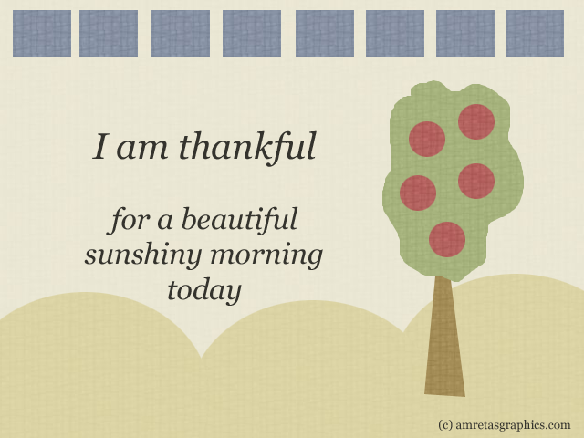
Third
choose from the digital papers one which will be the background. In the sample that you can download above (the link below the image), I use a light-beige paper. 
Here are the steps:
  • Open the file, click "select" on the menu on top, then click "all" on the sub-menu 
  • Click "edit" on the menu on top, then click "copy"
  • Now open the working board on the other window (if you click "window" on the menu on top, you can see the filenames at the bottom of the sub-menu. And if you haven't named your file, normally it will show as 'untitled')
  • Paste the file to the working board (click "edit" on the menu on top, then "paste")
  • voila, the background image is created

Fourth, let's get familiar with the "Marquee" tools

On the screenshot here, the toolbar is shown on the left. If you can't see it, click on "window" on the menu at the top, then make sure that the "tools" option is ticked.

Here, the Marquee tools are shown on the top-left corner of the tool bar. We will use mostly two of the marquee tools: the rectangular and the elliptical.

Now, try to use this tool. To follow the sample: open the yellow digital paper, then after clicking the elliptical marquee tool, place the cursor somewhere on the paper and drag your mouse until it creates a selection area with a size you want.

Copy the selected area (click on "edit" at the menu on top, then "copy") - then switch again to the working board and paste the selection.


Fifth, now move on and get familiar with the "Move" tools (located next to the Marquee tool, on the toolbar).

Notes:

  • when you paste an image to the working board, it will by default pasted on to the middle. You need to use the Move tool to move the image around, and make a composition of a few images together.
  • when you paste or add an image to the working board, a new layer will be created. You can check it with the layer window, shown here on the right of the screenshot. If you can't see it, click "window" on the menu at the top, then make sure that the option "layers" is ticked.


Now, move the yellow round image to the bottom of the working board. Make sure that the Move tool is working on / moving the right layer / image. You can check it with the layer list. The layer that you're working on will be highlighted.

To create a composition of several yellow round images like shown in the sample, you need to paste 2 more. And there are two ways of doing this:

  1. Click "paste" again : the same selection area / image will be pasted again to the working board.
  2. Click "layer" on the menu at the top, then click "duplicate layer". The highlighted layer / image will be duplicated.
Using the Move tool, move around the layers / images and make a composition as you like. You will use this Move tool all the time, so be sure to like it :o)

Sixth, more tools to be familiar with: "lasso" tools

On the toolbar, the lasso tools are located below the marquee tools. They are similar to marquee, but you can create your own shapes with these tools.

Now in the sample I will use the "polygonal lasso tool" to create a triangle (for the tree). Here are the steps:
  • Click the "polygonal lasso tool" then click it (the mouse) on the brown paper. Move the mouse / cursor until you get the length you want, to the direction you want, click, then move again to another direction, click, then move again to meet the start. Click. And then you must get a selected area as shown below.

Click "copy" then "paste" the image to the working board.

Notes: 
  • By now you know that when I write "copy", it means that you should click "edit" on the menu at the top, then click "copy" 
  • When I write "paste", it means that you should open / switch to the working board, then click "edit" on the menu at the top, and then click "paste" 
Now you'll get this on your working board:

You can use the Move tool to move around the brown image to the place that you want. You can repeat the "paste" or use "duplicate layer" as shown above to create more of the same images, if you want (why don't you try later?)

Seventh, let's get more familiar with the: "lasso" tool. I will create the leaves for the tree...

On a green paper (of course, open one first :o)) I click the "lasso" tool (the one on top of the three lassos - the 'free hand' one) - and then 'draw' leaves using the lasso. It needs a lot of practice. Just practice practice and practice. You'll love the 'homemade' cutout result. My drawing looks like this (see the selected area?):

Copy and paste the image to the working board

Again, use the Move tool to move the image until it gets to the place / position you like

Yay! Do you notice the rectangular blue images? Yip, I just repeated the same steps, only this time using the rectangular "marquee" tool. Then I did the same thing as the yellow round images: repeated the paste or duplicate layer steps, and moved the images to make a composition like shown above.

Eigth, add your gratitude text using "type" tool. Adobe Photoshop is fabulous when it comes to adding text. I really love this program. (Adobe InDesign is another, when you create documents for printing). Let's see the screenshot below:

Once you click on the "type" tool on the toolbar (the T button), the type toolbar will appear at the top. Choose the font, size, alignment (left, center, right) and anti-aliasing method (I always use "crisp" - that's the best I found!) - click your mouse somewhere and start writing. Don't worry you can edit the text later. Just start somewhere.

To edit the text, make sure that you're on the "type" mode (the type tool is clicked) and that you're on the right text layer (see on the layer list - the text you want to change should be highlighted. If not, click on the list the layer you want to edit, it will be highlighted)

Now select / highlight the text you want to edit. Change the size, the font, the alignment. 

To edit the color of the text, after highlighting the text you want to edit, click on the color box next to the text alignment options. Play with the colors... (pssst: playing with colors is one of my favorite subjects, so I will talk about this in one of my next posts in the series. stay tune)

Once you're done, click on the Move tool and you can move the text around :o)

Tips:
Don't forget to create a copyright text, a small one but visible, and place it on the corner (or wherever you like, it's Your creation :o))


Now the final step for this week's exercise: SAVE your work as IMAGE

When you're ready, and your working board looks good... hit "file" on the menu on top and choose "save as" or "save for web" on the sub-menu. Then, save it as gif, jpg, or png file. Just experiment and play a little bit until you find the format that you think it's best for you.

And voilà! Congratulations! You've completed your first exercise! :o)

Well..... how do you like it? I hope you have a nice start and that now you're inspired and energized with the words of gratitude on the cutout cards you are going to create. 

Personal note from Amreta:
"A gratitude card a day brings happiness your way"

Do-It-Your-Way challenge this week

  • starting tomorrow, set aside at least 30 "graphic goodness" minutes a day for yourself.
  • do a lot of practice and get familiar with your "working board"  and the basic tools and functions we talked about in this post: copy and paste, duplicate layer, move tool, marquee tools, lasso tools, and type tool.
  • repeat these basic cutout graphics creating steps minimum 3 times a day
  • create one gratitude card a day (if you want to create more than one it's okay too :o))
  • share the cards online. blog it or post it on facebook. tweet it.
  • be grateful each time you complete the task! :o)

Have a graphic goodness today!


    follow me on Twitter